Role
Client
Date
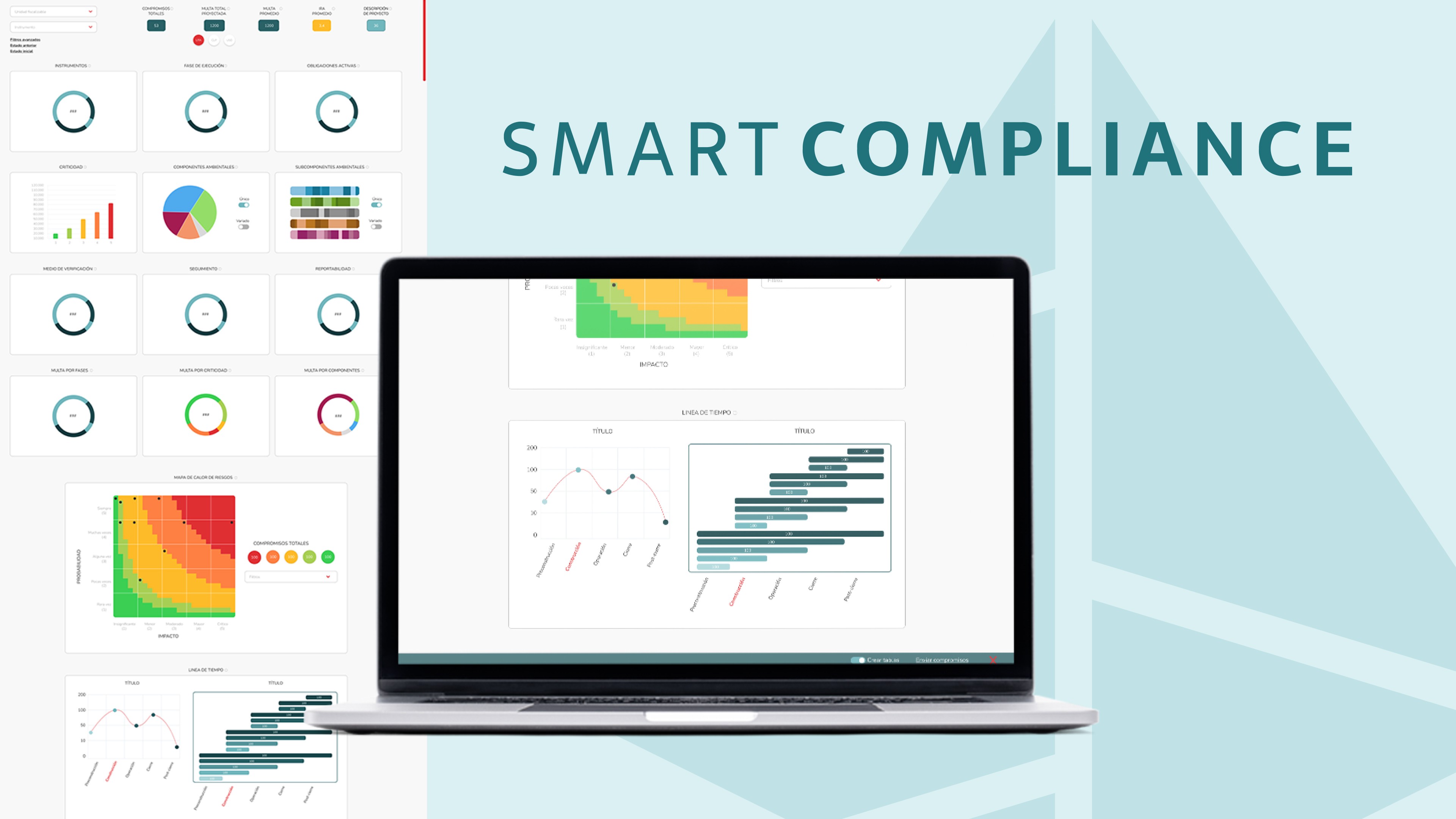
Environmental teams were drowning in data—but still struggling to make decisions.
They had:
Massive, complex datasets
Fragmented tools across project phases
Difficulty communicating insights to stakeholders
The result: slow analysis, errors, and missed opportunities for proactive action.
I focused on one core question:
How might we turn complex environmental data into something people can actually understand and act on?
To solve this, I:
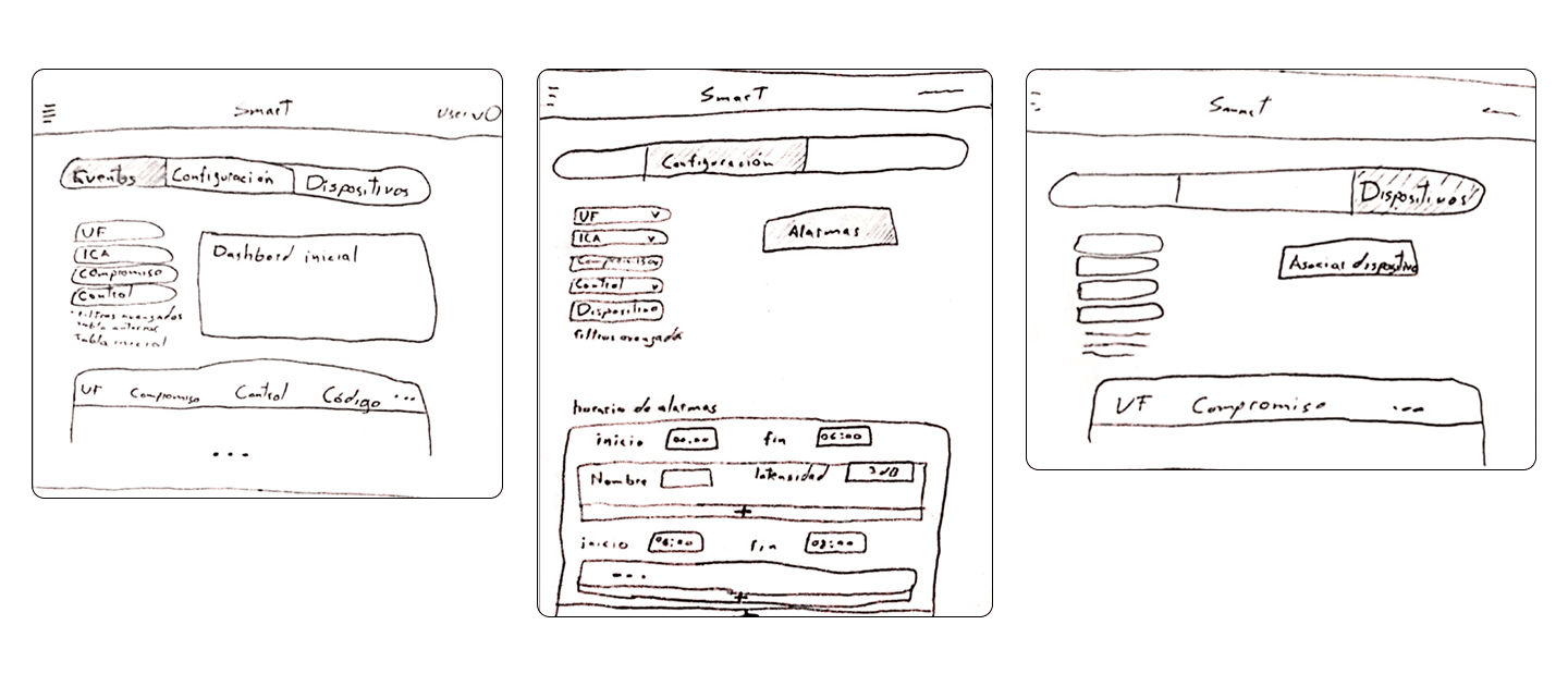
Mapped user workflows across project phases
Identified key decision points
Prioritized clarity over data density
1. Data → Insight (Not just visualization)
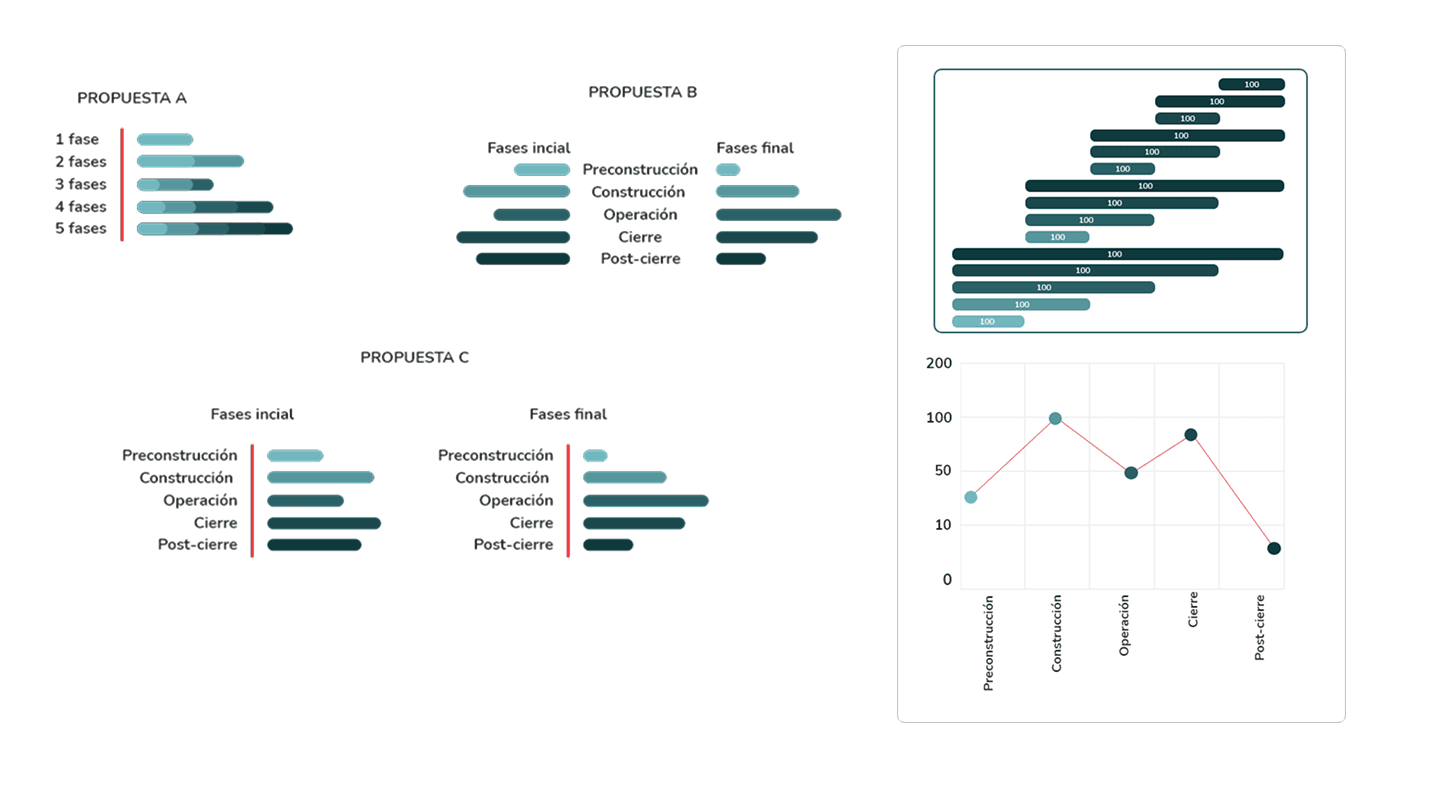
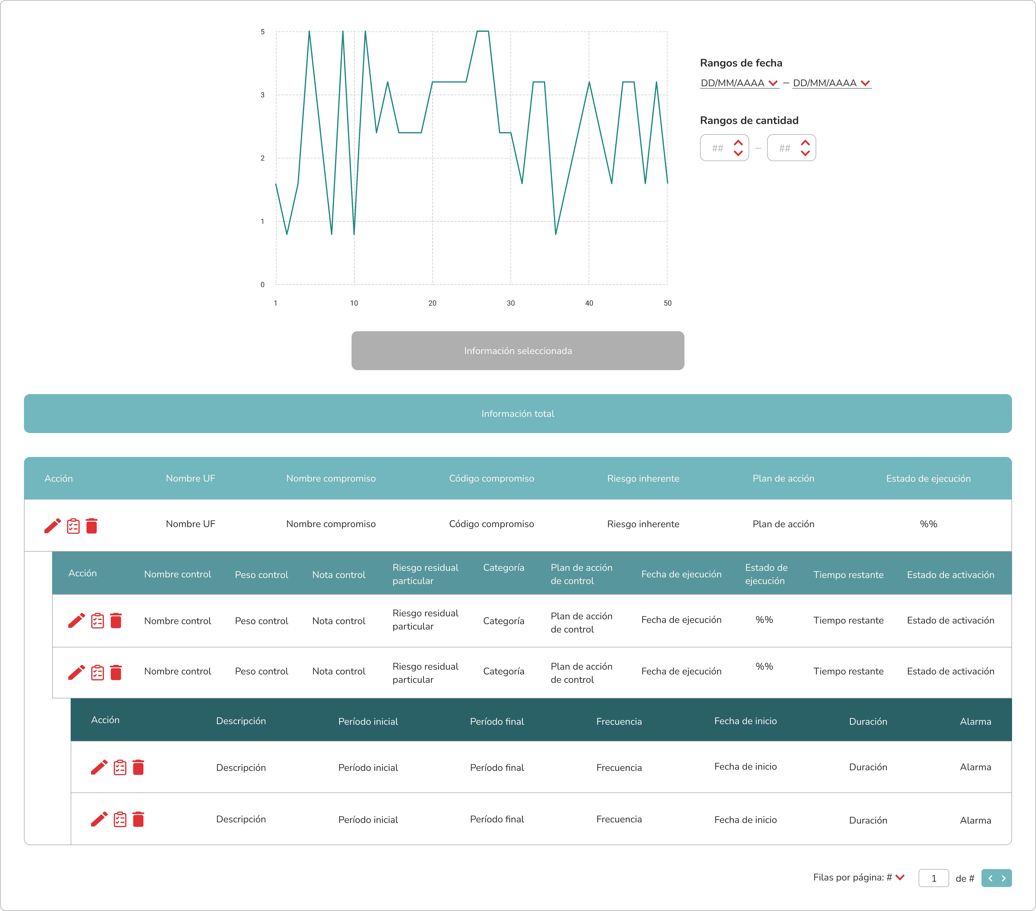
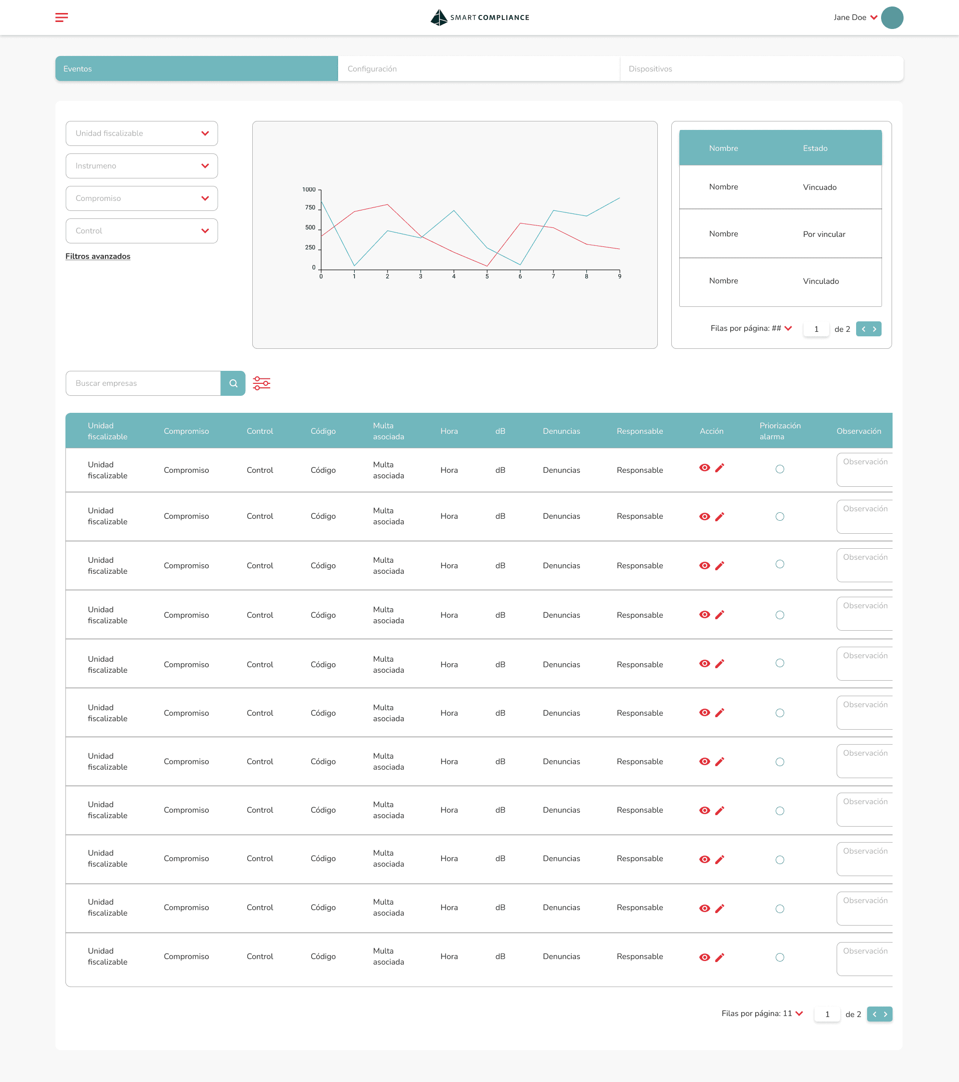
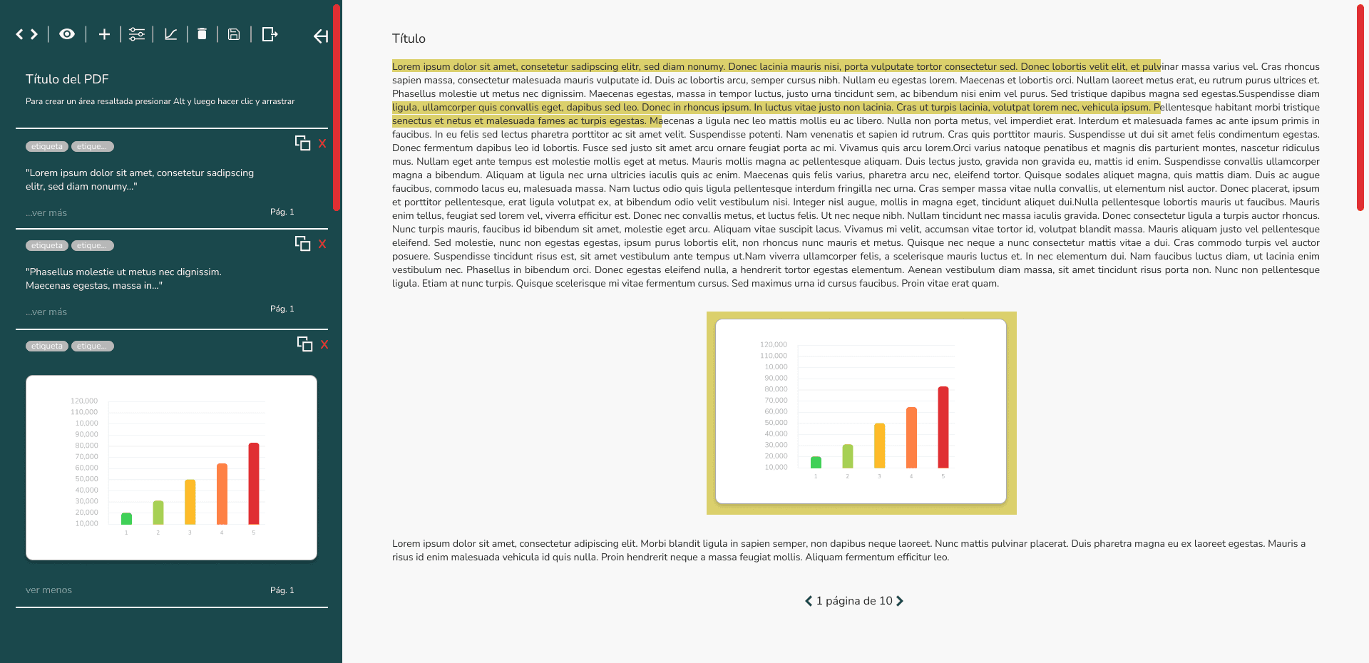
Designed interactive charts, heatmaps, and timelines
Highlighted patterns and risks at a glance
Reduced cognitive load and analysis time
2. Clear Information Architecture
Structured dashboards around key decisions, not raw data
Prioritized critical metrics and simplified navigation
3. Visual System for Fast Decisions
Color-coded statuses (risk, priority, compliance)
Consistent UI patterns and iconography
Users could instantly understand what needed attention
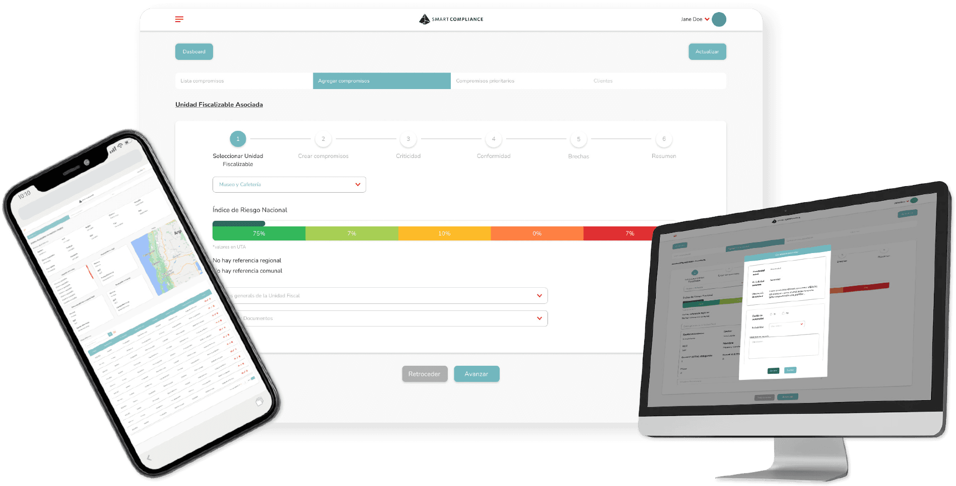
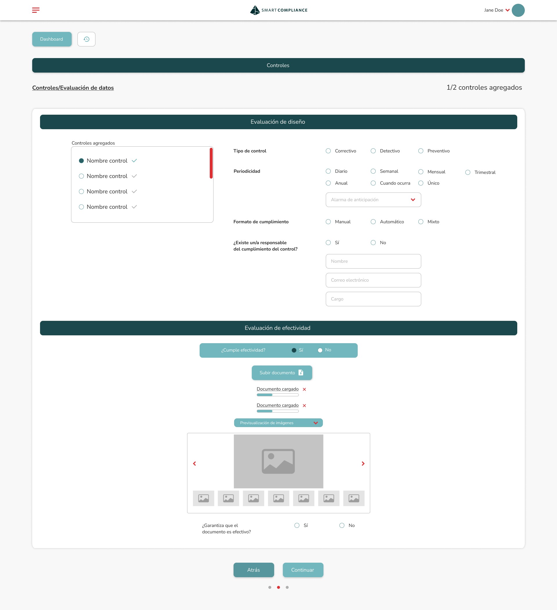
4. Guided Workflows
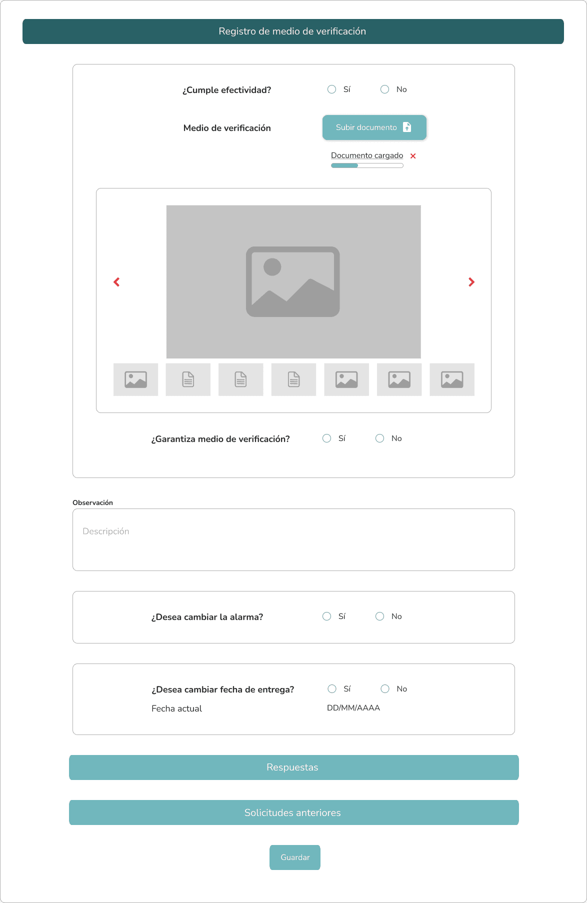
Step-by-step flows for complex tasks (reports, compliance, forecasting)
Tooltips and progress indicators
Reduced reliance on training
Faster data interpretation and decision-making
Reduced user errors through clearer hierarchy
Improved communication between technical and non-technical stakeholders
Clarity beats completeness when dealing with complex data
Good data visualization is not decoration—it’s decision-making
Designing for workflows > designing screens